The 10 Longest-Lasting American Logos

A company’s logo is a defining part of its identity. It can help consumers easily recognize a brand and distinguish it from the competition. This is why some corporate logos have endured with barely a change for more than a century. Not surprisingly, most of the 10 oldest corporate logos still in use belong to household name brands. They may have undergone minor tweaks, but their continued success has kept them alive. Each has its own unique history and heritage, so 24/7 Wall St. featured the 10 oldest Fortune 500 company logos still used today for a look at the logos defining our lives.
10. DuPont – Founded as an explosives maker in 1802, the company created a monopoly on gunpowder manufacturing during its first century of business. Today’s DuPont products have an array of uses from body armor to cooking appliances. While the original logo featured a ribbon tied into the letters and the company’s founding year, those elements were phased out over time. Their signature oval design was introduced in 1907, but experienced many variations before becoming standardized in 1948.
9. Sherwin-Williams – The company’s original “Cover the Earth” logo was created in the 1890s and featured a can of paint spilling over the planet. Although there were doubts about the design, it was believed to portray the company’s growth and had officially replaced a chameleon as the company’s logo by 1905. Today, the company has achieved that anticipated growth and become the largest manufacturer of paint and coating in the U.S.
8. Goodyear – The company was founded in 1898 by Frank Seiberling but named after Charles Goodyear, the man who discovered the process of improving rubber by heating it with sulfur. In 1900, the company sought to differentiate itself by embracing the wingfoot symbol as its logo because Seiberling owned a statue of the Roman god Mercury that had winged feet. Today, that logo still appears in ads and can be seen on Goodyear blimps worldwide.
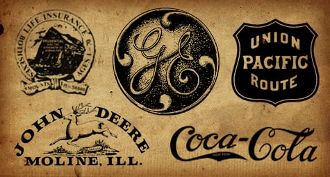
7. General Electric – The company’s trademark was initially registered in 1900 as a monogram with the letters GE within a shaded circle. Interestingly, that GE font was first used in 1892 when the Edison General Electric Company merged with the Thomson-Houston Company. The company remains one of the most recognized brands around the world and the majority of their revenue now comes from outside the U.S.
6. Campbell’s Soup – Founded in 1869 by Joseph Campbell and Abraham Anderson, the company’s original logo was designed in 1897 and was orange and blue. The following year, the logo’s colors were changed to red and white after a company executive saw that color combination on Cornell’s football team. The word “soup” was officially added to the company’s name in 1922. The logo became truly iconic when it was immortalized in paintings by Andy Warhol in 1962.
5. Prudential – Founded as Prudential Friendly Society in 1876, the company first used the “Rock of Gibraltar” logo in an ad in 1896 along with the phrase, “The Prudential has the strength of Gibraltar.” The company has evolved to offer a variety of financial products to both individuals and institutions and today earns an annual revenue of $84.8 billion.
4. Union Pacific –Since 1887, the company has used a shield as its logo. The following year, they added patriotic colors and the words “The Overland Route” to the shield. They experimented with a more modern look in the 1940s but soon returned to the patriotic colors without the added phrase. In 1962, they once again redesigned the logo into a square, red-and-white shield but soon reverted to the original colors and that logo has remained to this day.
3. Johnson & Johnson – Founded in 1886 by the Johnson brothers to produce surgical dressings, the company’s logo was designed to resemble the signature of one of the brothers and has stayed the same since the beginning. Interestingly, the company has often placed a red cross symbol on its products and unsuccessfully sued the American Red Cross for trademark infringement in 2007.
2. Coca-Cola – Pharmacist John Pemberton started selling Coca-Cola at Jacobs’ Pharmacy in Atlanta in 1886 and the company soon adopted its world-famous cursive logo. The logo has been slightly tweaked over the years, with the white underlying ribbon added in 1969, and that logo can still be seen worldwide today.
1. John Deere – Their trademark image of a deer jumping over a log was registered in 1876, but the company had started using it three years earlier. The logo has evolved over the years, most notably the deer has been changed to a North American species from an African one and the log has been removed. Also, the initial logo was in black and white with “John Deere” printed above the deer, but the current version is in green and yellow with the name written beneath the deer.
It’s fascinating to see the path that popular logos have taken over the years. They have managed to be tweaked and transformed with the times while maintaining the essence of their true identities.
Use creative branding to strengthen and support your company’s image. Contact MDG today at 561-338-7797 or visit www.mdgsolutions.com.
MDG, with offices in Boca Raton and New York, NY, is a full-service advertising agency and one of Florida’s top creative ad agencies. MDG specializes in developing integrated marketing solutions, exceptional creative executions, and solid branding and media-buying strategies that give clients a competitive advantage. Our core capabilities include print advertising, branding, logo design, creative, digital marketing, creative media planning and buying, radio and TV advertising, Web design and development, infographic development, email marketing, social media marketing, and SEO. To see how other well-known logos have progressed through the years, take a look at this infographic, “A Graphic Look at the Evolution of Corporate Logos.”
